With Wyng Themes, its easier than ever for marketers to create on-brand digital experiences at scale.
What are Themes?
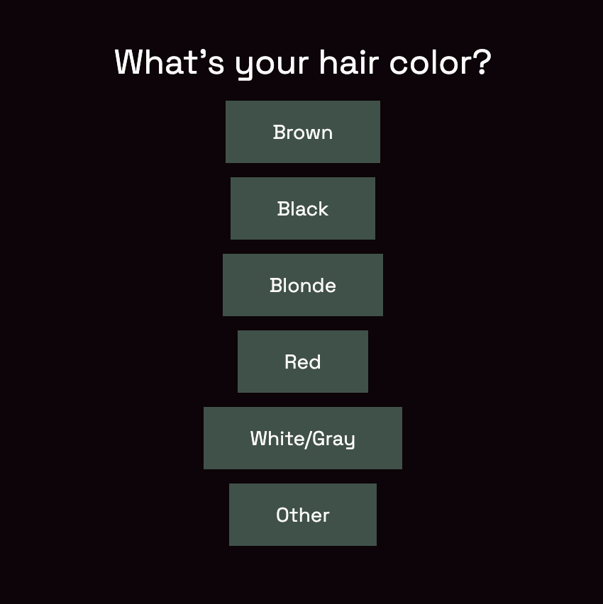
Sometimes brands want to use consistent design elements – like colors, fonts, and button styling – across various experiences. With Wyng Themes, design elements can be predefined once, and then applied across all Wyng-built experiences in just a few clicks.
Here’s a quick video overview of Themes:
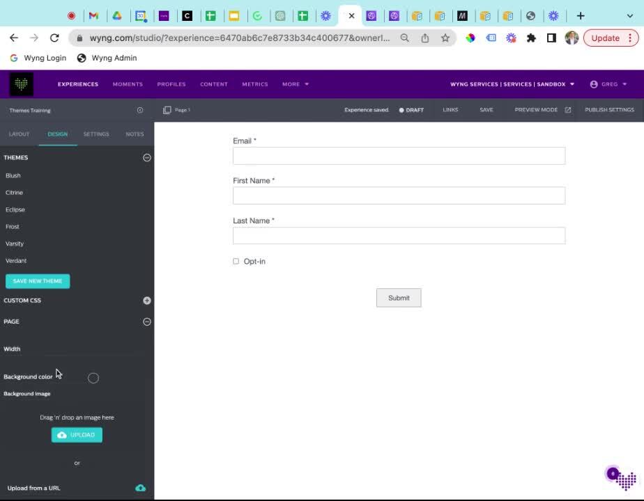
Wyng Themes
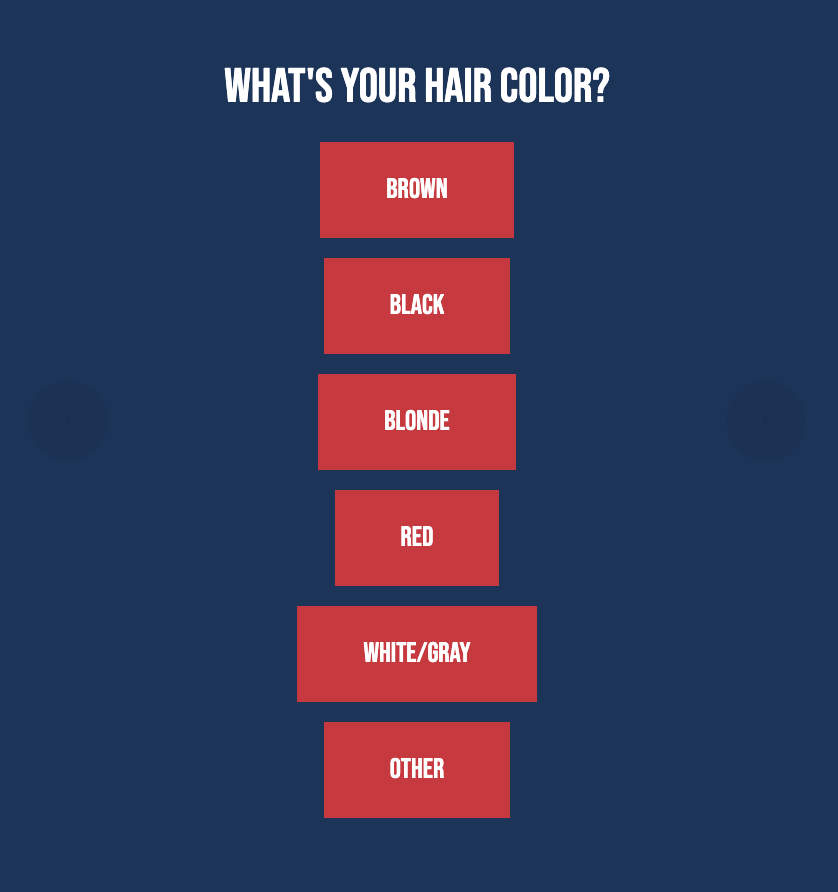
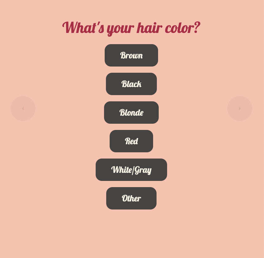
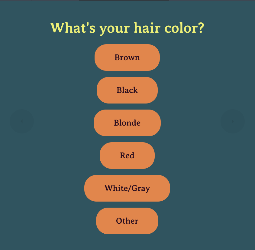
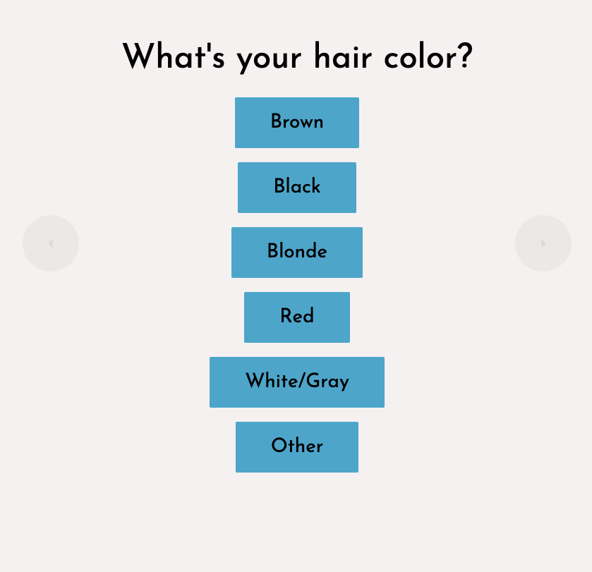
To help jumpstart your use of Themes, Wyng offers six pre-built Themes (Verdant, Varsity, Blush, Citrine, Frost, and Eclipse) that can be applied to any experience. You can use a Wyng Theme as a starting point for your own custom design, by revising the configured settings and saving.
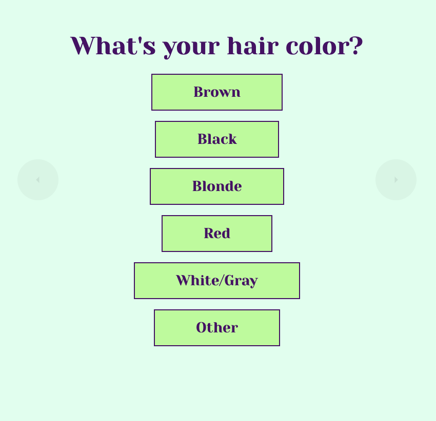
Custom Themes
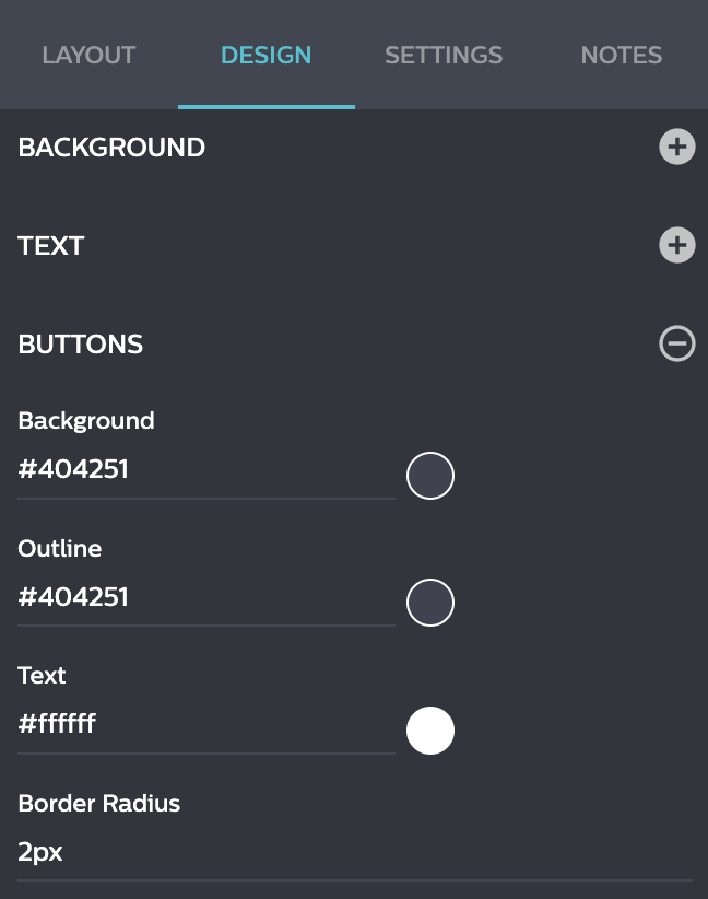
To configure your own Theme, click the “Design” tab when editing an experience. On the Design tab, select a dropdown category (CUSTOM CSS, CONTENT, BACKGROUND, TEXT, or BUTTONS) to style that element. Configure the available options for as many categories as you want. Any settings you configure and save will be copied to a new builder when you apply that Theme. Once done, save your Theme for future use!
Setting Default Property-Level Themes
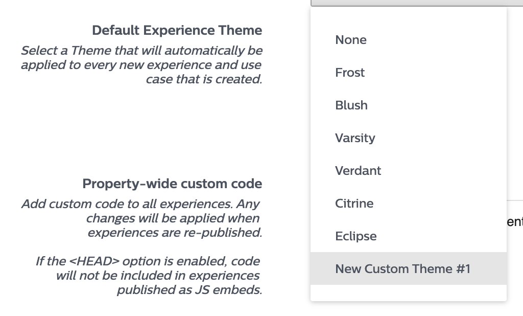
After creating the perfect Theme, Admin users of Wyng can set a default property-level Theme, so every experience created in Wyng is consistently on-brand (no matter who is building it!). Setting a default Theme is also a great way to speed-up the creation of experiences and increase team efficiency.
Ready to Get Started?
Existing Wyng users should check the comprehensive guide to Wyng Themes in our Help Center. Or, if you are new to Wyng – start your free trial today! Get started with one of our dozens of pre-built experience templates. Maybe you want to try building a product finder quiz, sweepstakes, scratch-off, or spin-to-win! Once you’ve selected your experience, use a Wyng Theme to make it shine!
